Behind the Cover: How We Choose Materials, Binding and Paper for Each Book
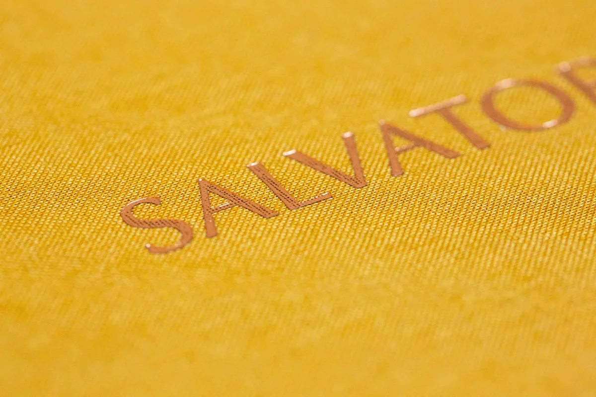
Pick up a book from Plantain's portfolio and close your eyes. Run your thumb across the cover. Feel the grain of the linen, the slight indent where foil has been pressed into cloth. Touch the paper and feel its slight tooth.
Before you've read a word, our books have already told you something.
That's intentional. At Plantain, book materials are part of the storytelling. The cover, the paper, the binding, the foil, even the packaging, each choice is made in conversation with the story inside.
Here's how we think about it.
The Cover Sets the Tone
The cover is the first sentence of the book. It communicates mood, personality, and intent before the reader turns a single page.
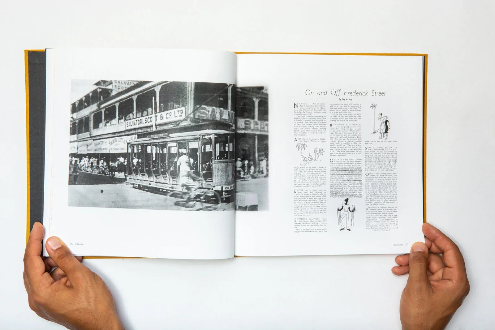
For the Salvatori family history – the story of a Corsican migrant who built a department store empire in Trinidad – we chose hot toffee linen with copper foil. The warmth of the toffee carries the Mediterranean and Caribbean earth, while the copper catches the light and reflects an authority that suits the permanence of this gentleman's legacy.
The memoir Luck Beat Obeah demanded something bolder. Sapphire linen with red foil – a combination that reflected the energy and confidence of the first woman to ever commission a memoir from us. It matches a story that is vivid and unapologetic.
For a Fortune 500 leader's memoir, the cover had to communicate something entirely different. This is the story of a man whose life philosophy was built around three words: Athletic, Aesthetic, Ascetic. The cover needed to embody that discipline. Grey linen with red print: restrained, sophisticated, deliberate.
And the Uganda Railways history, commissioned by the Cross-Cultural Foundation of Uganda, called for a matte black hardcover – institutional gravitas appropriate for a book that would raise awareness of a national monument and help fund Uganda's first National Railway Museum.
Frankie Dolly: Catch Me If You Can! took yet another direction: a cream softcover, approachable and intimate, suited to a story told with warmth and humour.
Each of these covers was chosen for the specific story it houses. None would work transplanted onto another book.
Paper You Can Feel
Paper is one of those things most people don't consciously notice, until they hold something printed on really good stock.
We print at high-end presses where colour accuracy is precise enough to honour a photograph taken sixty years ago. But the paper itself matters beyond colour reproduction. Its weight affects how the book sits in your hands – too light and it feels cheap; too heavy and it becomes unwieldy. Its texture affects how you experience the page. We often use paper with a very subtle roughness, so as to make photographs feel more present and text more grounded. A completely smooth finish can feel clinical.
We also think about how the paper ages. A book designed to be passed down through generations should be printed on stock that holds its colour and doesn't yellow. Archival-quality paper costs more, but for a book meant to outlast its creator, it's the obvious choice.
Binding That Lasts, Typography as Voice
Our books are meant to be passed between family members at Sunday lunch, and to be passed down generations. For that, the binding needs to be able to take it.
We don't use perfect binding (the glue-only method common in mass-market paperbacks) for our bespoke projects. For hardcovers, we tend to use sewn binding: thread-stitched signatures that allow the book to open flat without cracking the spine, and that will hold together after decades of use.
And then there is the typography – one of the less visible choices, but one of the most important. The typeface we use for your book is part of the voice. It should feel as natural as the storyteller sitting across from you.
For Doreen Ahow's memoir, the typography had to match a woman of personality and directness. We chose ITC Caslon and Lora (striking fonts with presence) and paired them with bold reds on white uncoated paper. The result reads the way Doreen spoke: confident, warm, and unmistakably her own.
A template service uses one or two typefaces across all their books. A bespoke studio auditions dozens before choosing the one that sounds right for your story. The reader may never consciously notice the typeface, but they'll feel it. The wrong font creates a subtle friction (something is off) even if the reader can't articulate what.
Why Any of This Matters
You might reasonably ask: does the cover material really matter that much? Can't a great story survive in a generic binding?
Technically, yes. The words don't change based on the weight of the paper they're printed on.
But a family history book or a company anniversary book isn't a novel you read once and shelve. It's an object that lives in a home or an office for decades. It gets picked up by guests. It gets shown to new employees. It gets pulled down by grandchildren who want to understand where they came from.
As we explored in our piece on the romance of the printed book, there's a sensory dimension to physical books that digital formats can't replicate, and these qualities invite people – time and time again – to spend time with the book.
A book that feels substantial, considered, and beautiful will be opened more often than one that doesn't. And every time it's opened, the stories inside get another chance to be heard.
See the Range
Browse Plantain's portfolio to see these material choices in context. Each one was designed from the story outward.
If you're thinking about a book of your own — and you care about how it feels as much as how it reads — we'd love to talk.